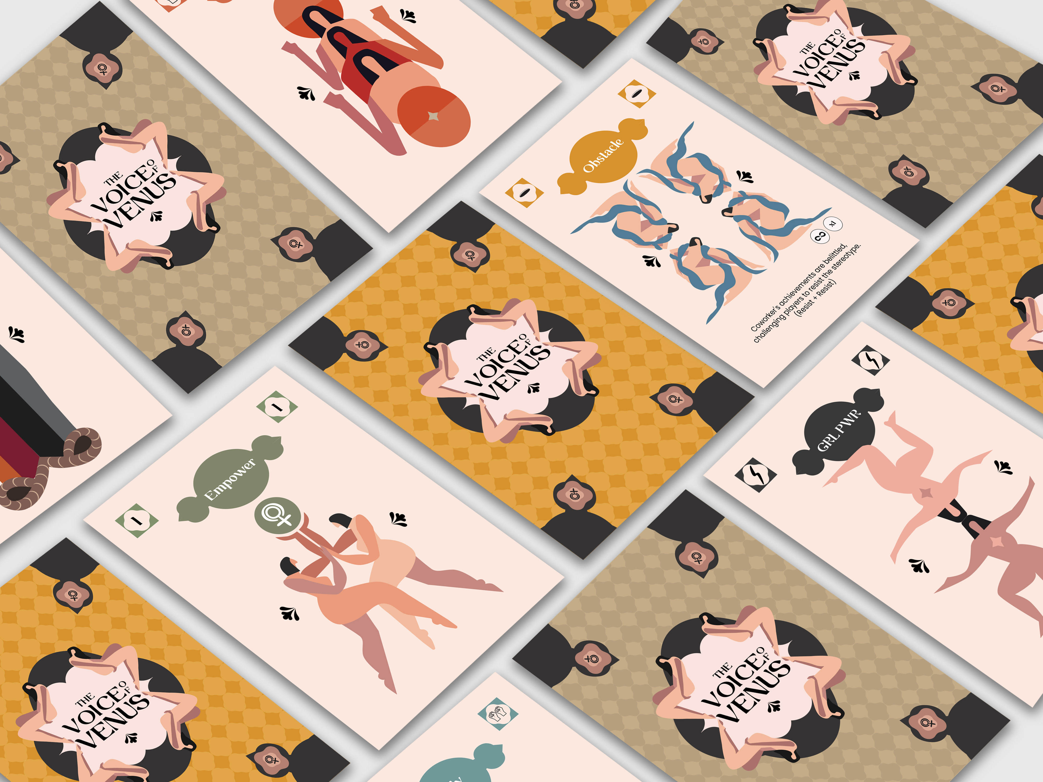
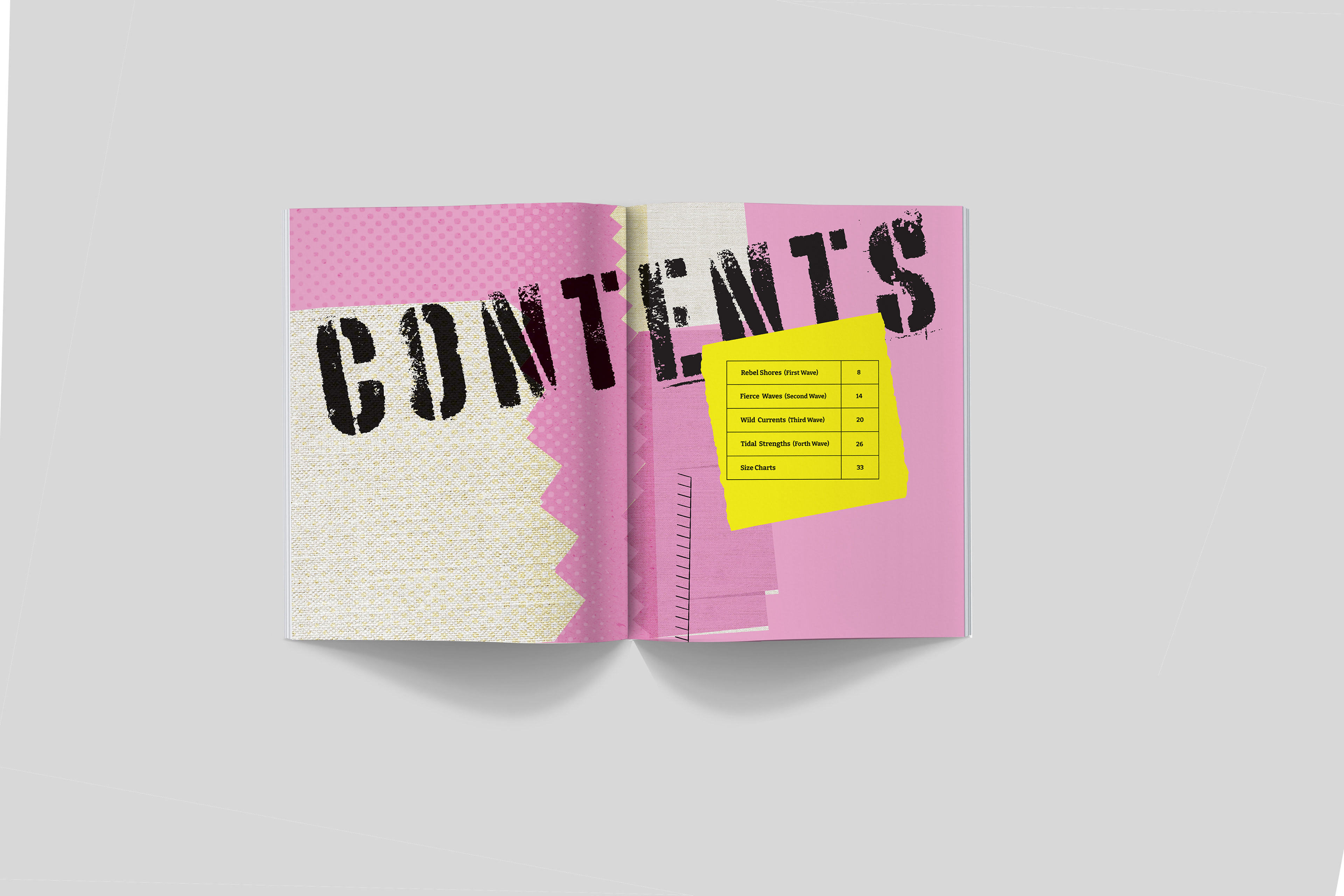
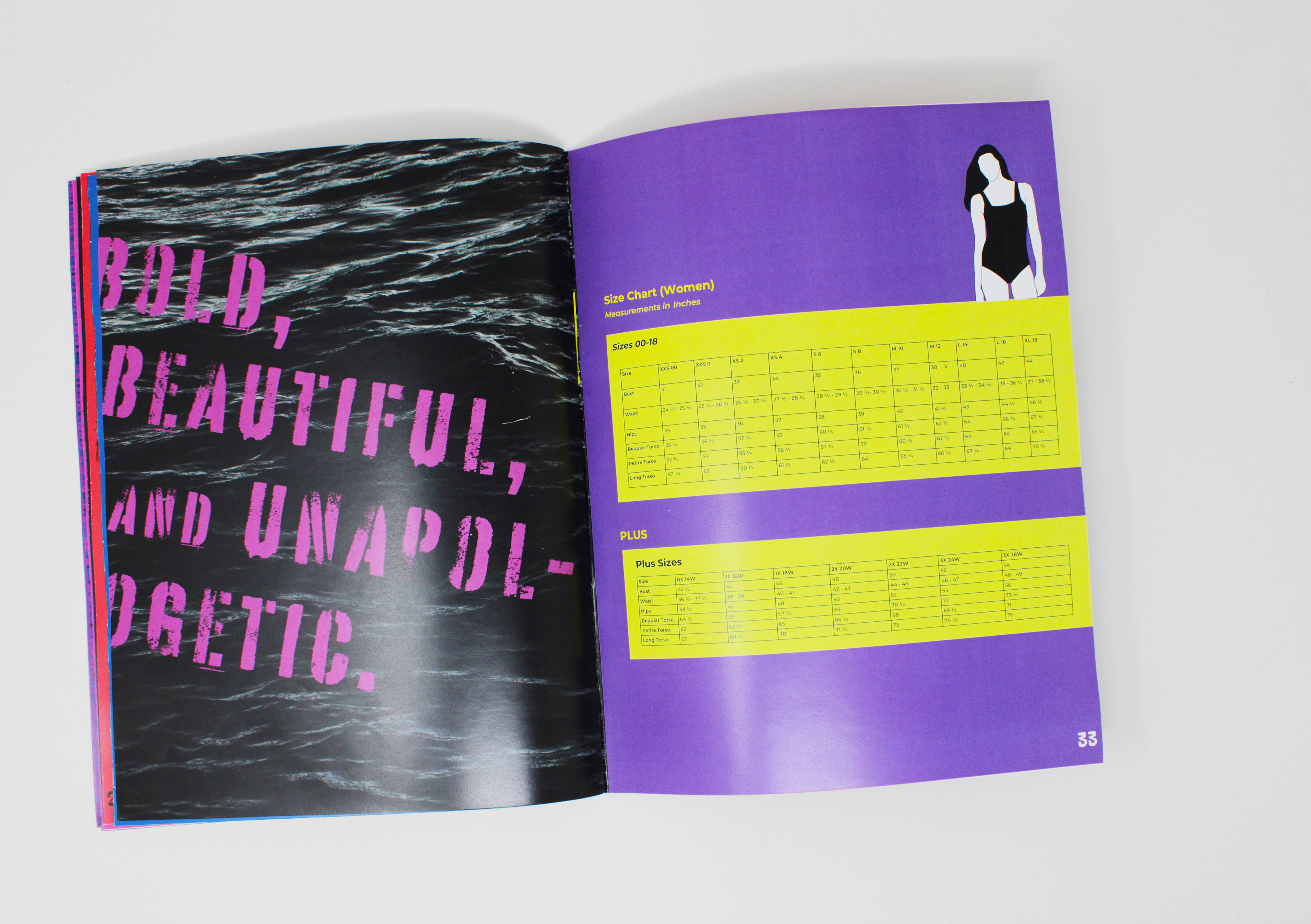
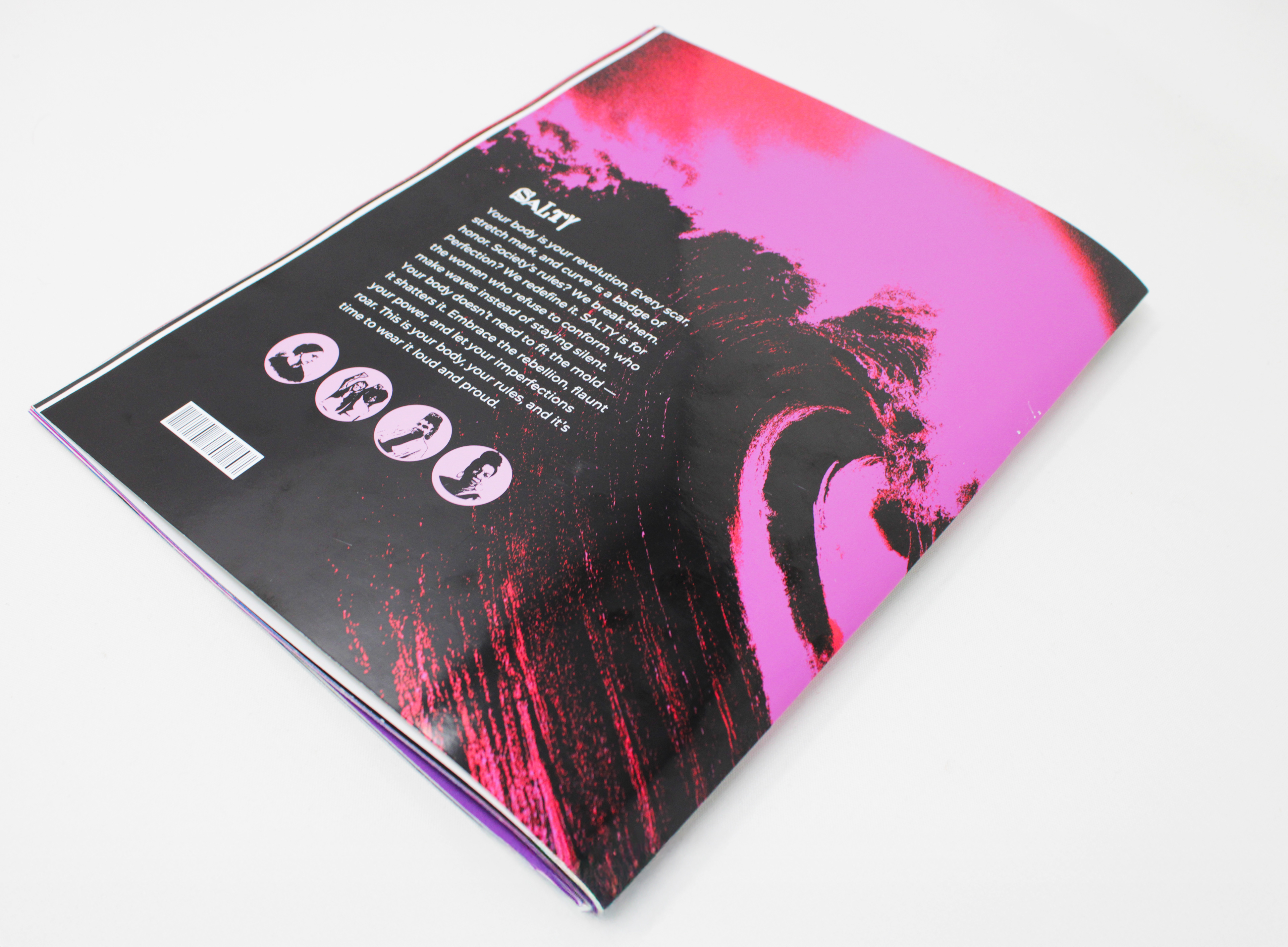
Salty, Swimsuit/ Catalog Design
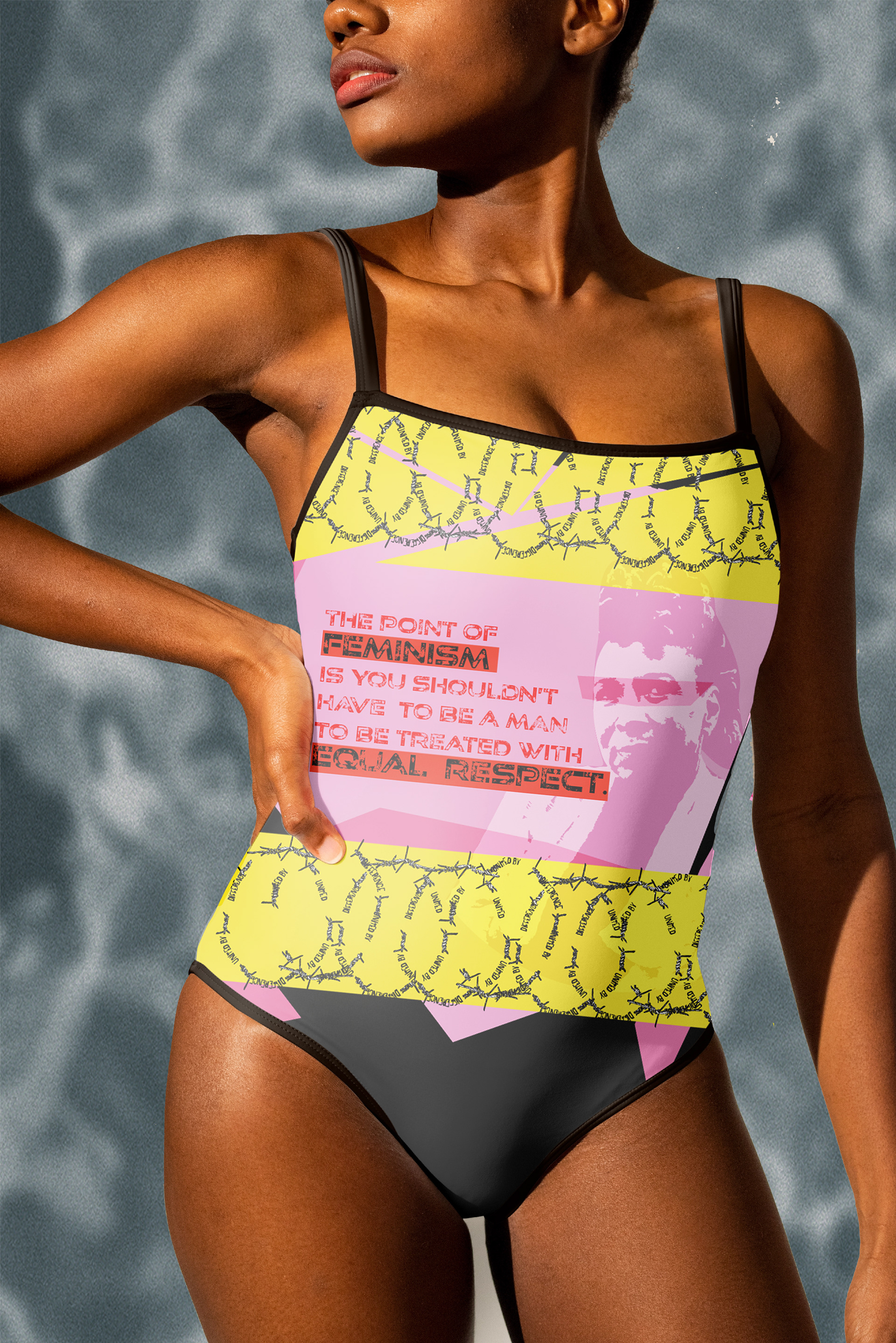
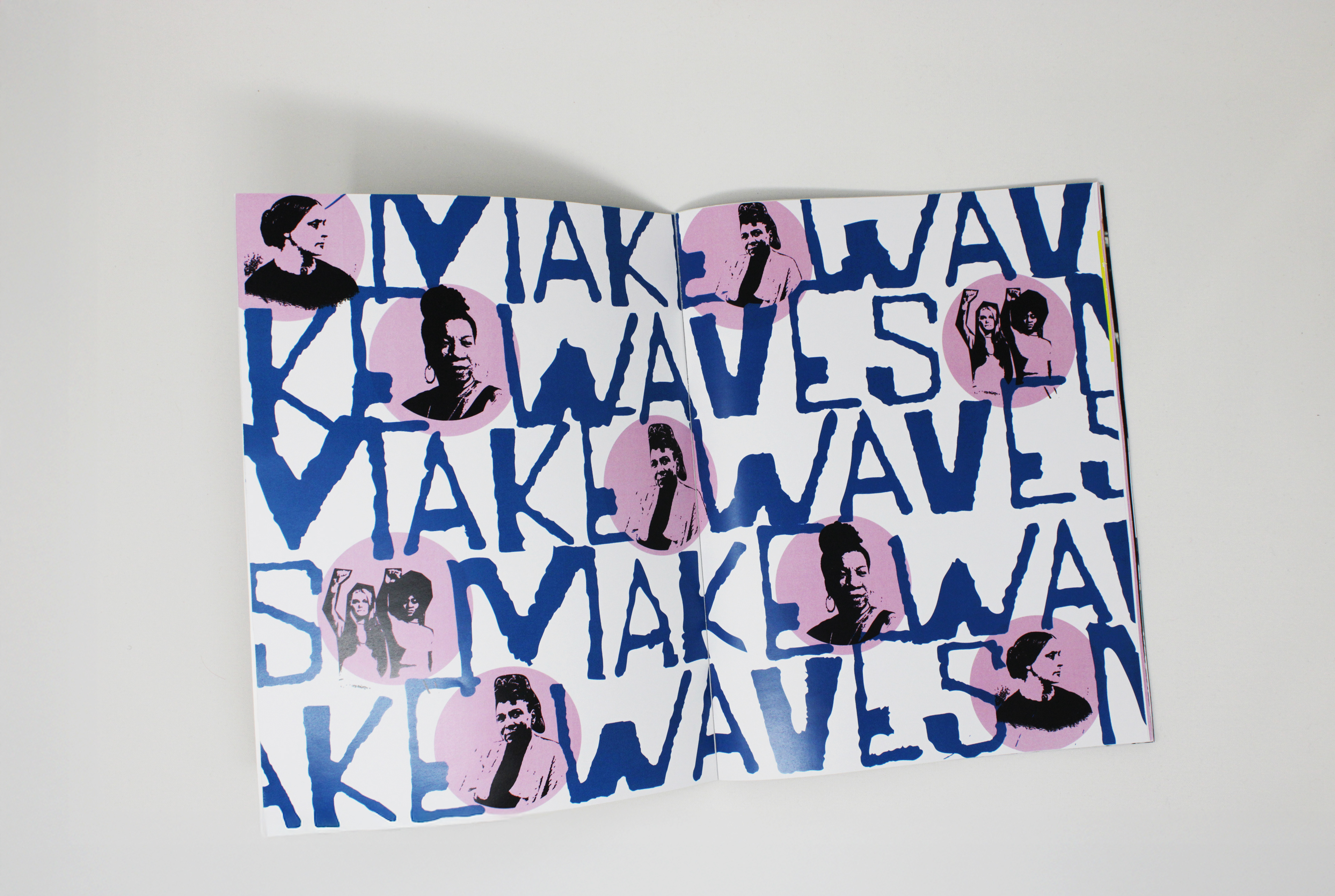
Salty is a swimsuit catalog design that reimagines swimwear branding through a bold, unapologetic lens. Inspired by historical feminist figures who challenged beauty norms and redefined self-expression, the design celebrates body diversity and confidence. The brand’s core slogan, "Make Waves," aligns with the spirit of feminist movements throughout history, symbolizing resistance, change, and empowerment. The visual identity incorporates strong typography, dynamic layouts, and striking imagery to reinforce themes of individuality and self-liberation.

Design Process
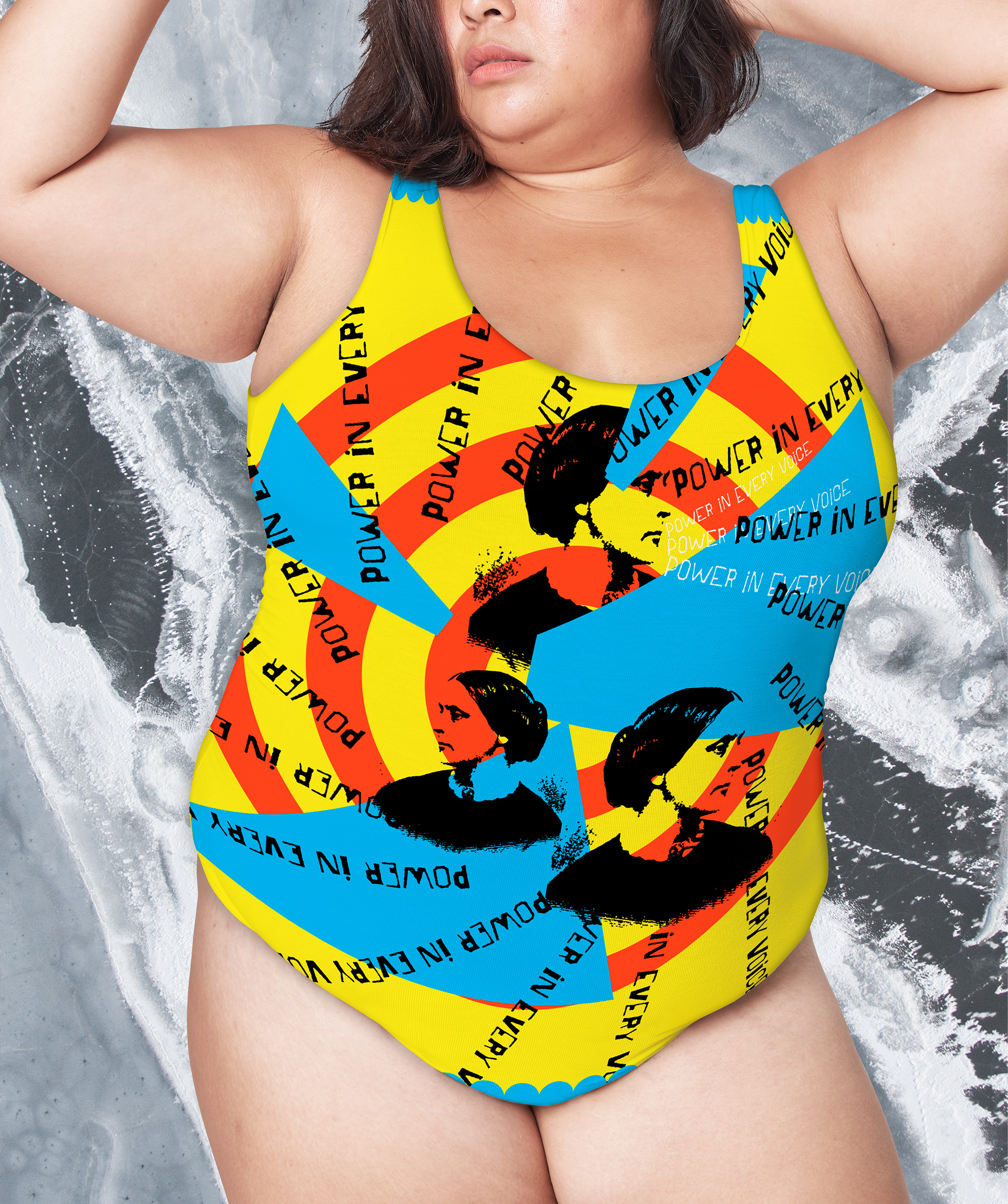
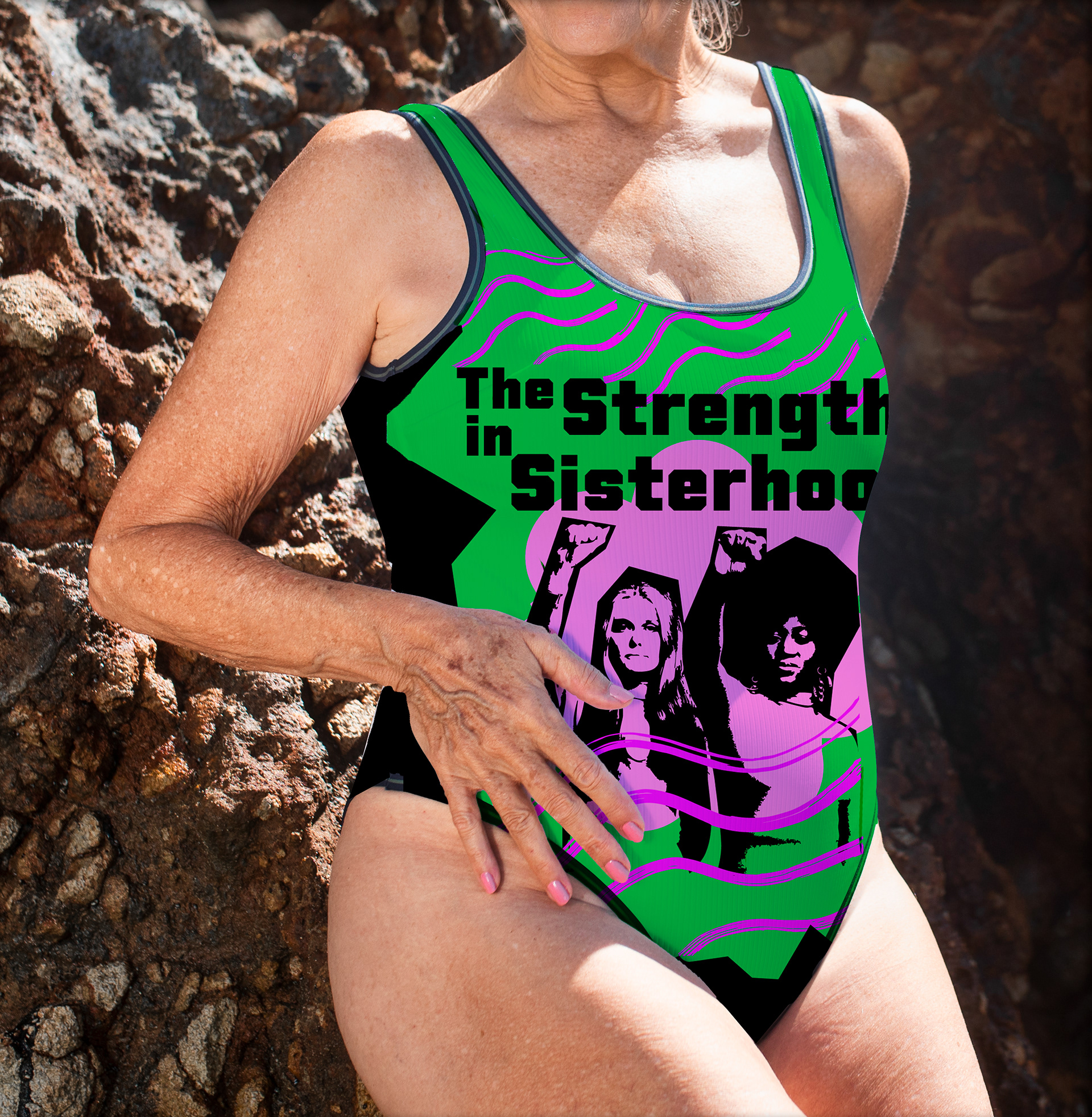
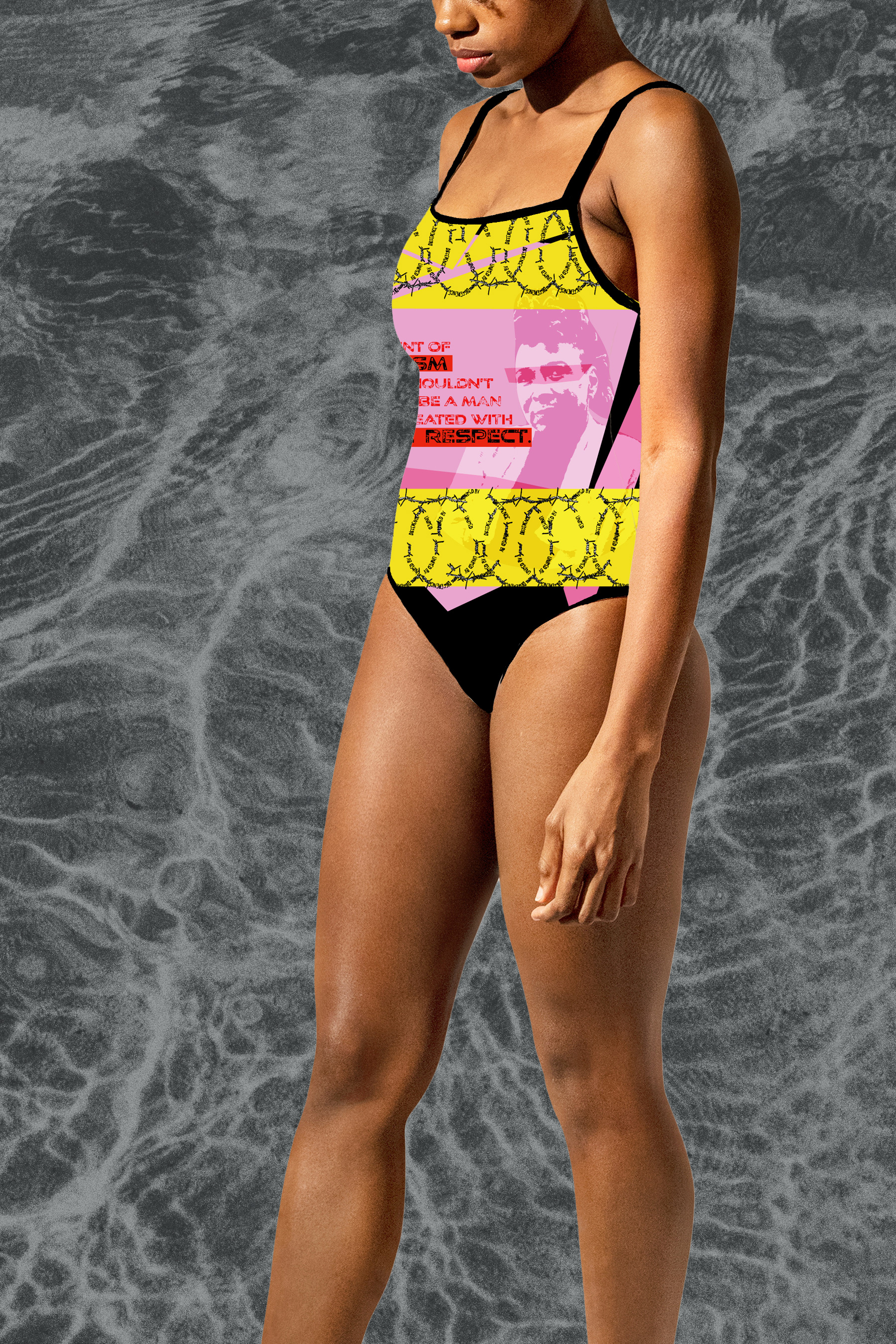
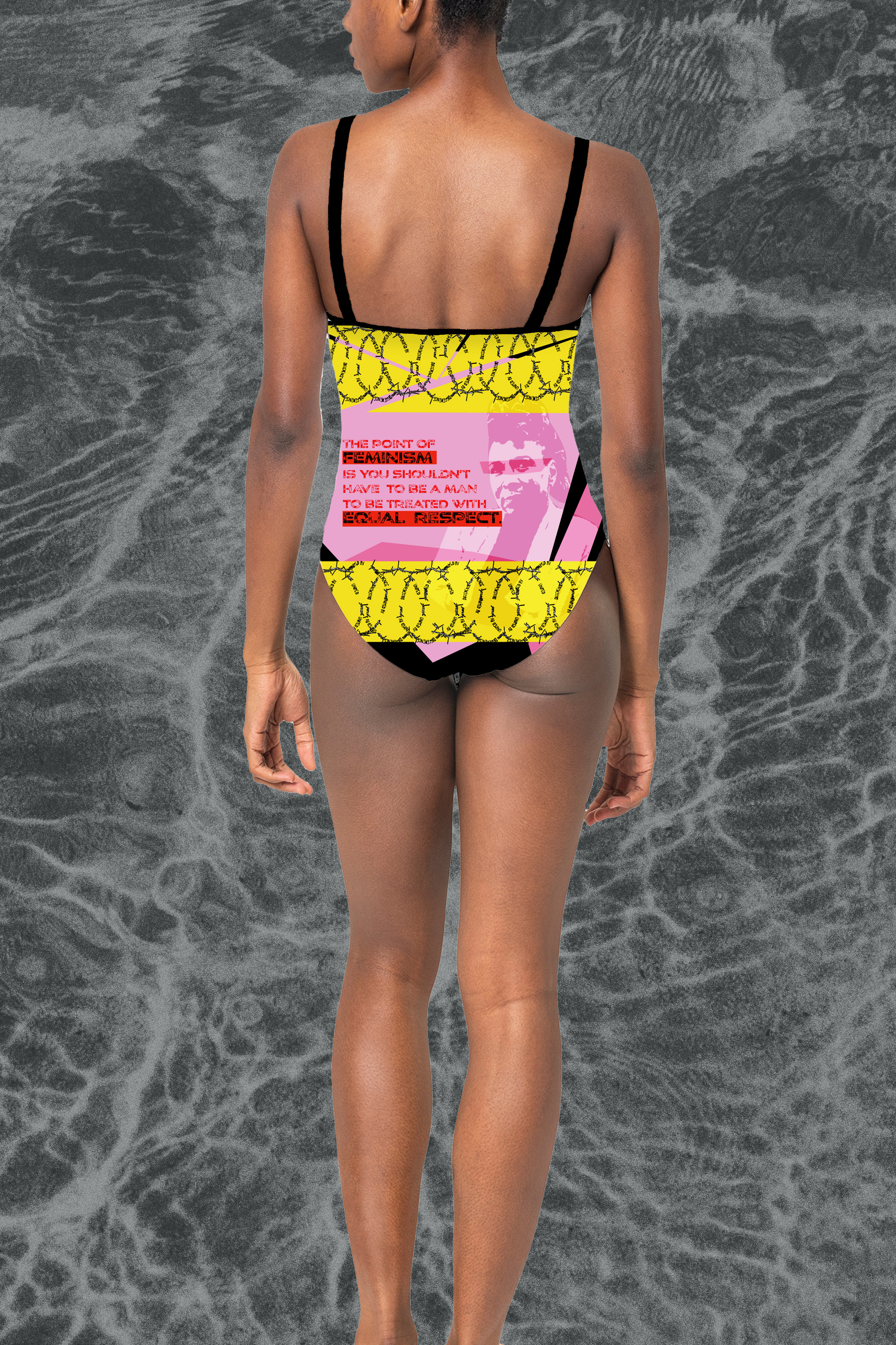
The design for Salty blends abstract patterns with portraits of iconic feminist figures, channeling the raw energy of the punk rock era. The visuals embrace a rebellious, unapologetic aesthetic—layering bold textures, high-contrast imagery, and dynamic compositions to reflect the brand’s defiant spirit.
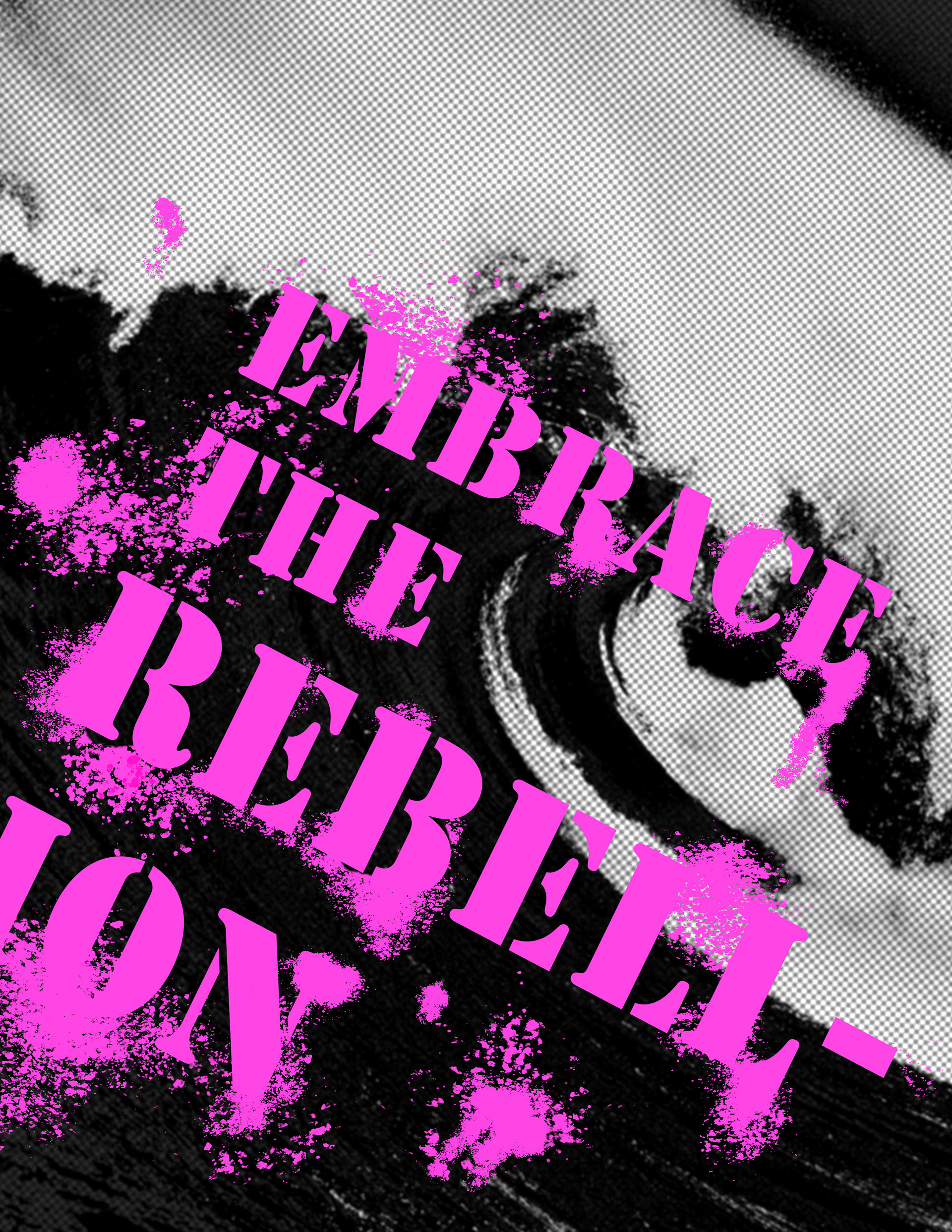
Inspired by feminist movements that have challenged norms, the design merges grunge-inspired typography, distorted graphics, and collage-like elements to create a visual language that is both provocative and empowering.
I started by exploring the visual and cultural evolution of feminism, researching how each wave challenged societal norms and reshaped identity. Through this process, I analyzed historical design elements, protest visuals, and editorial layouts to build a cohesive aesthetic that felt both rebellious and empowering.
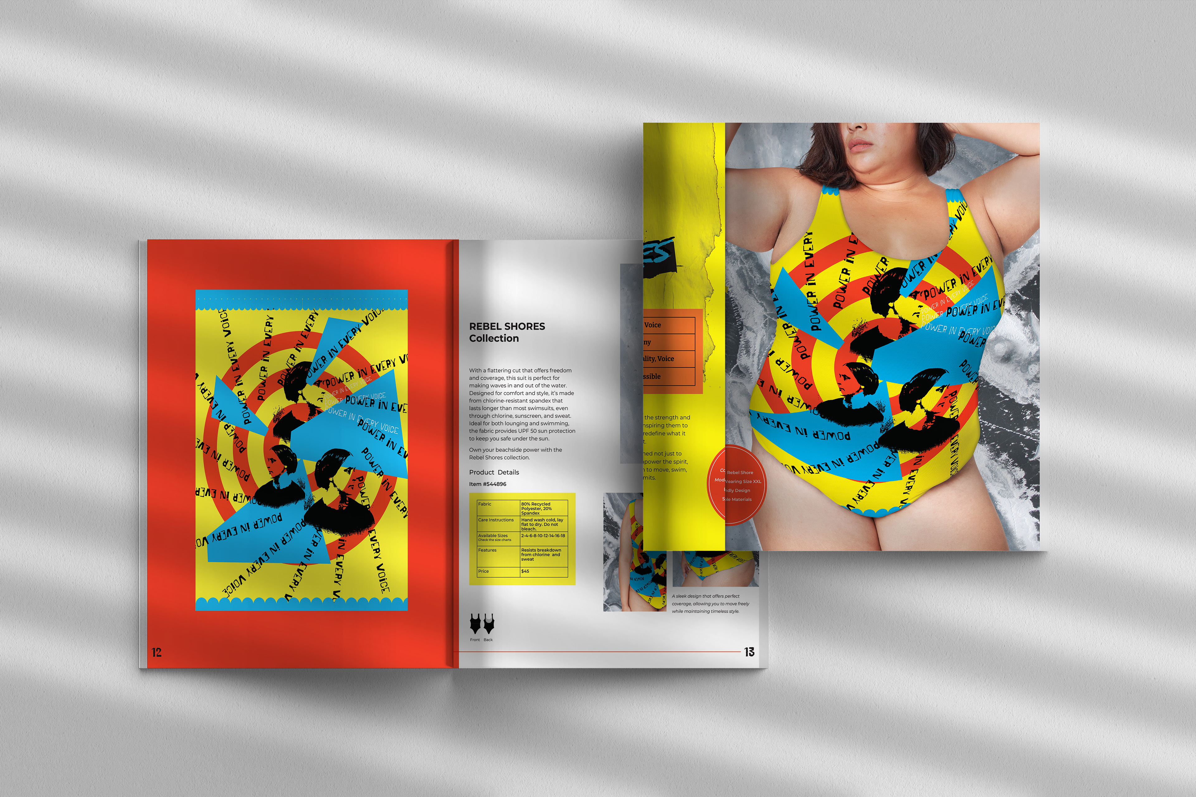
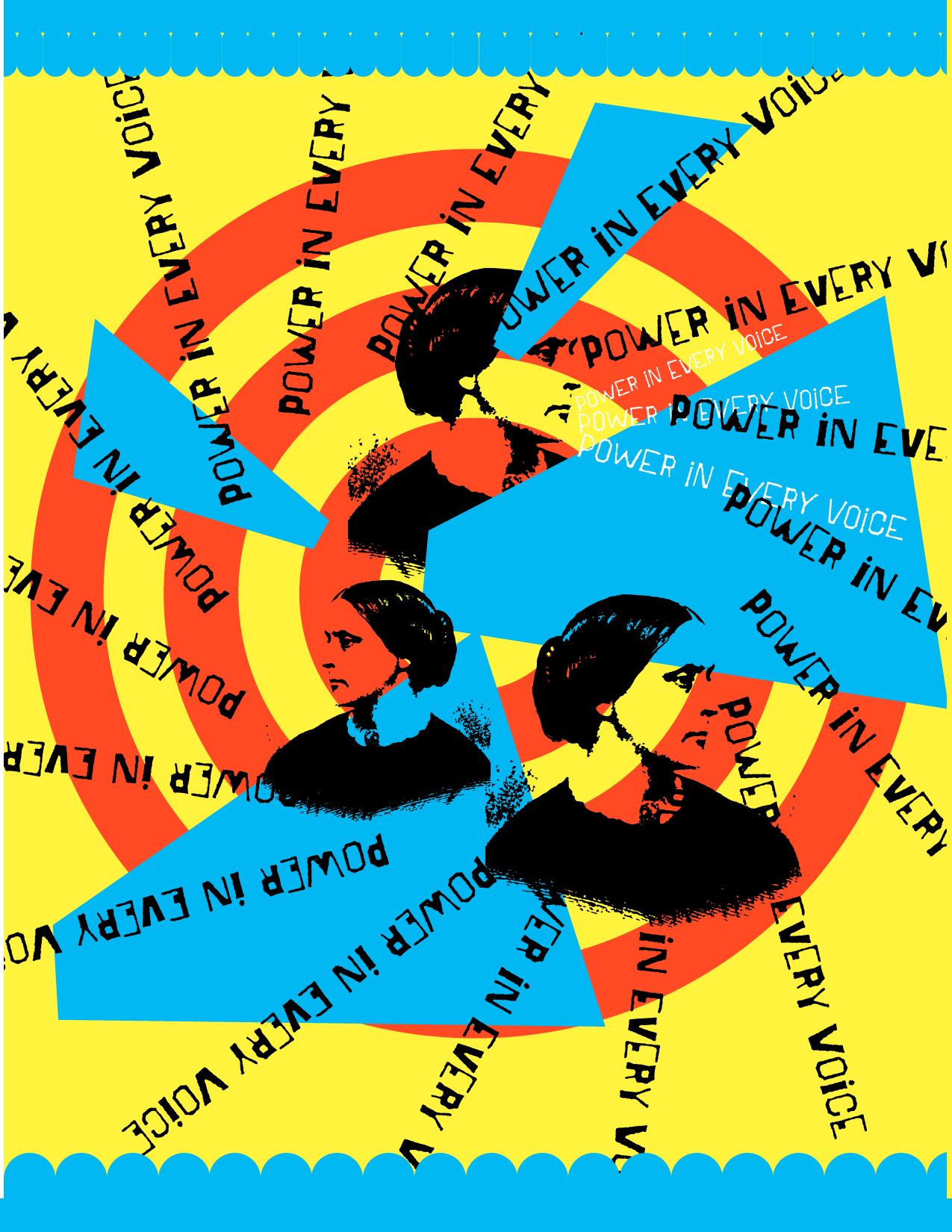
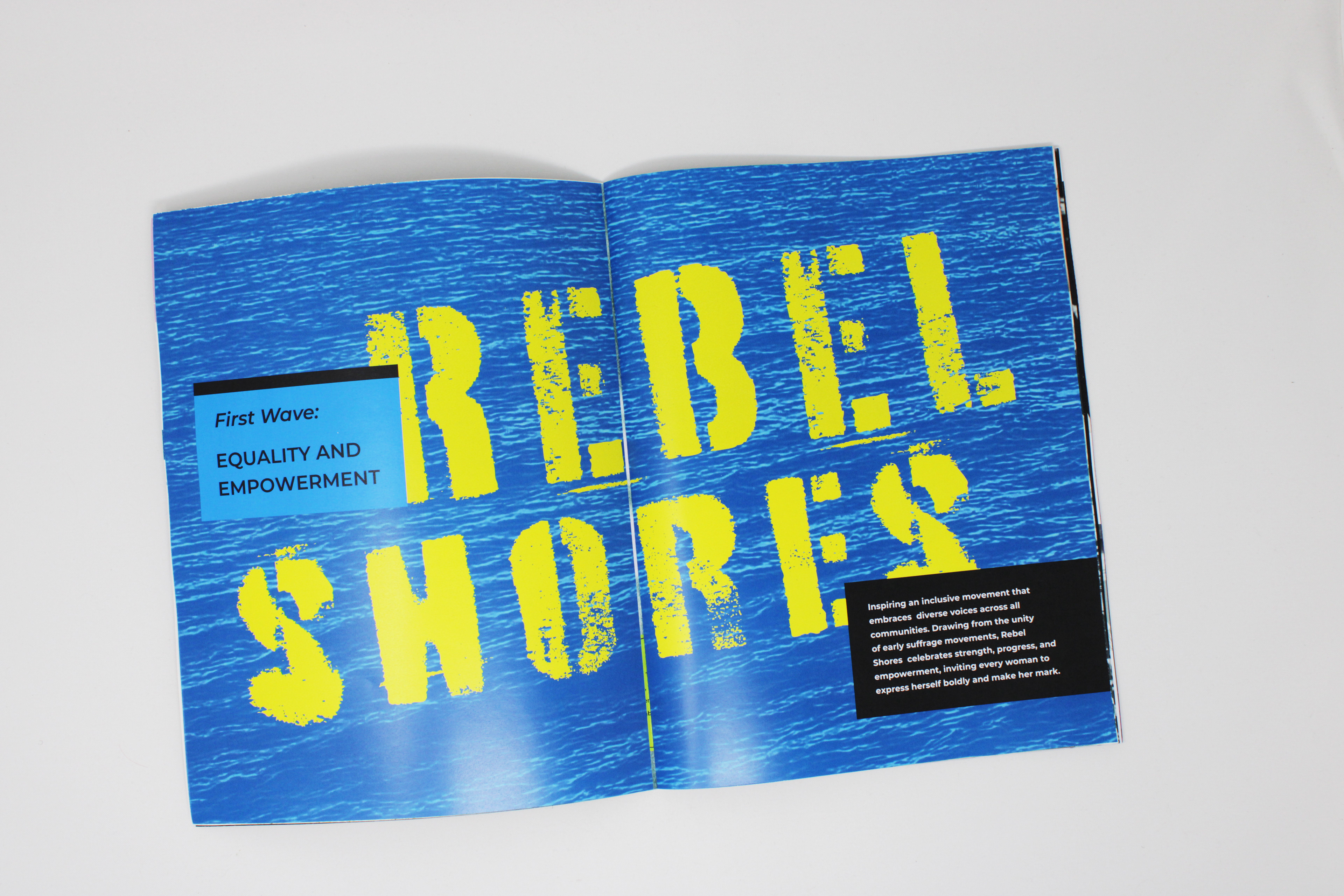
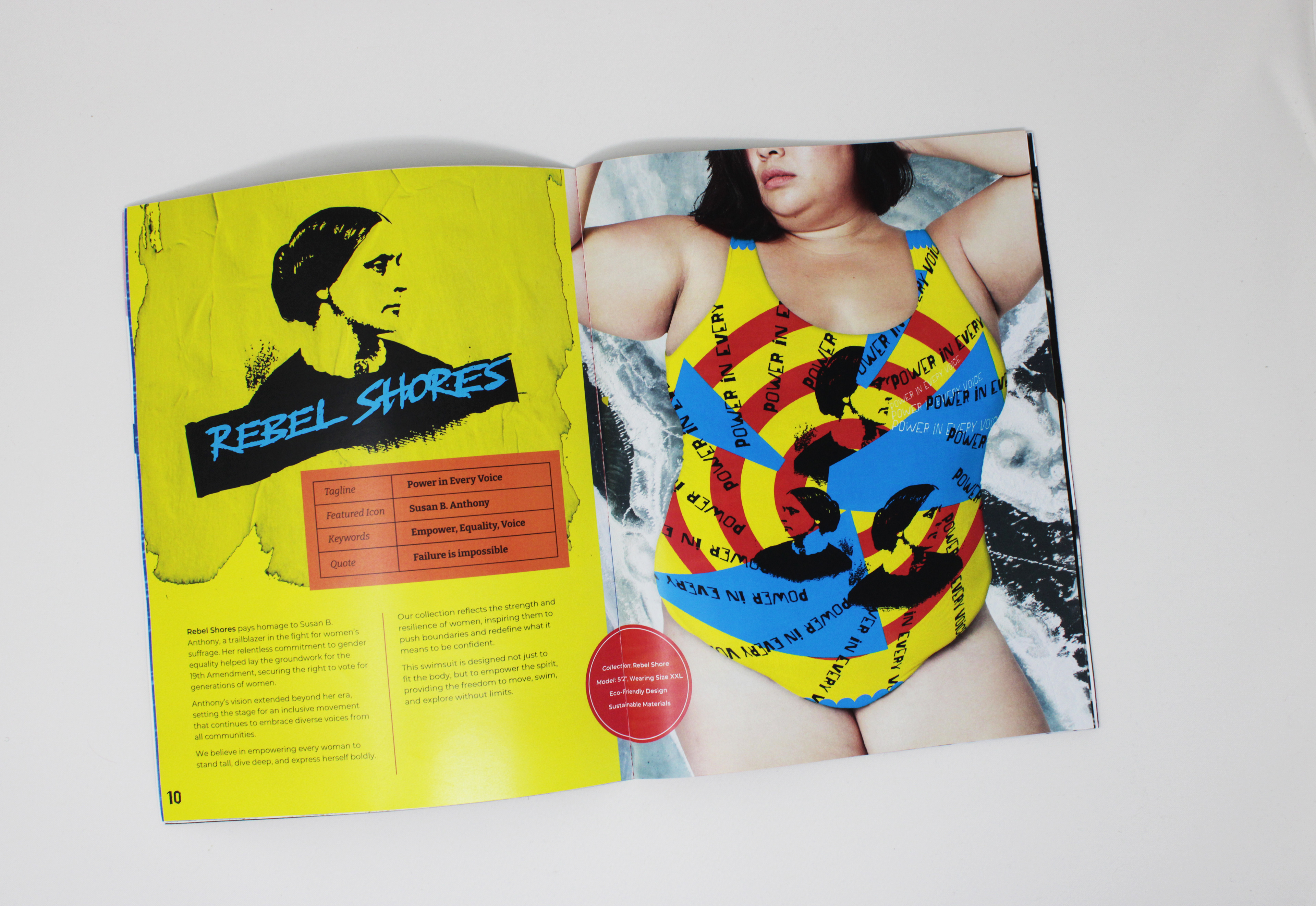
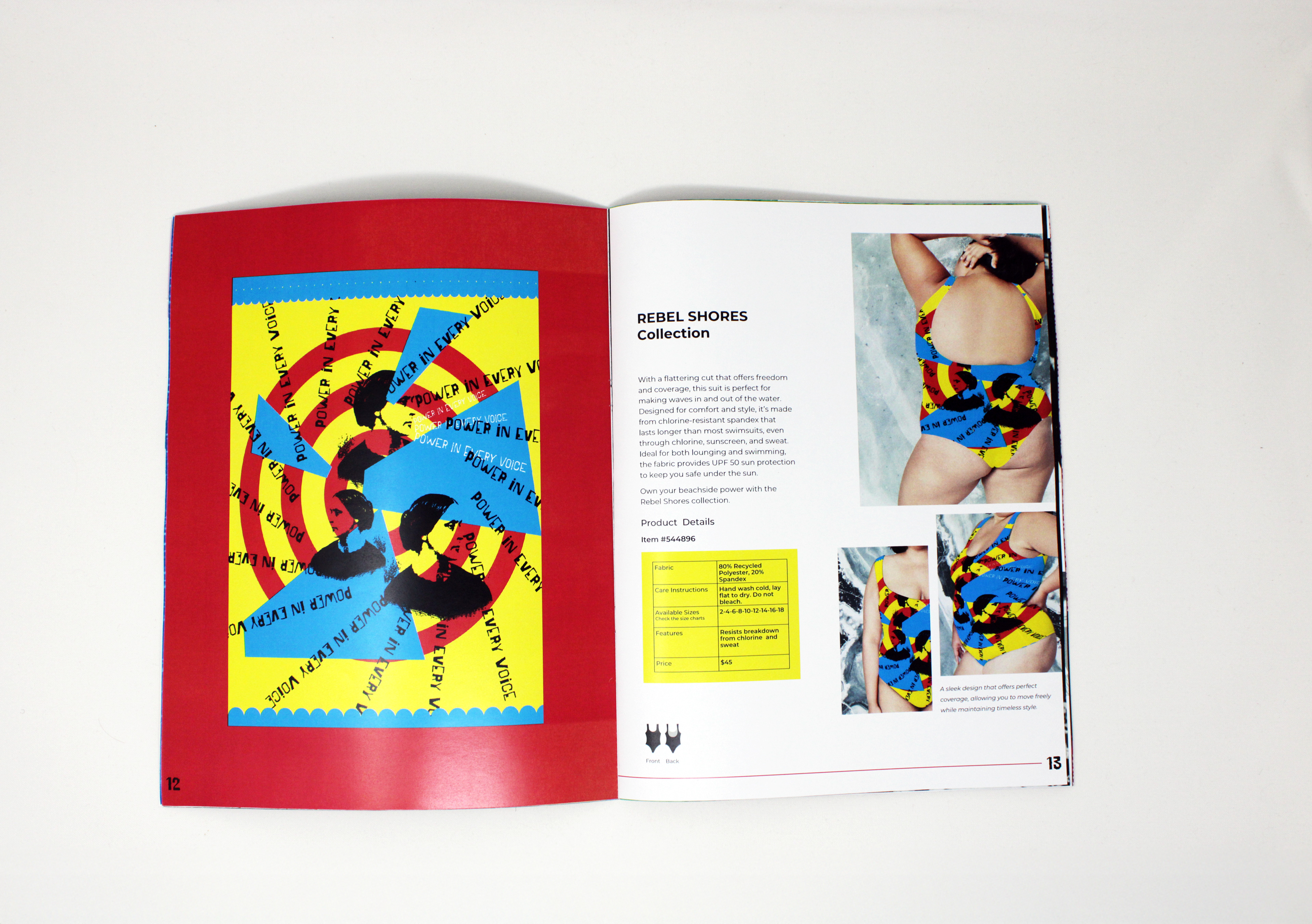
Rebel Shores began with archival research, drawing inspiration from suffrage-era posters and printmaking to reflect the bold activism of Susan B. Anthony. The raw, typographic-driven compositions set the foundation for the visual identity.
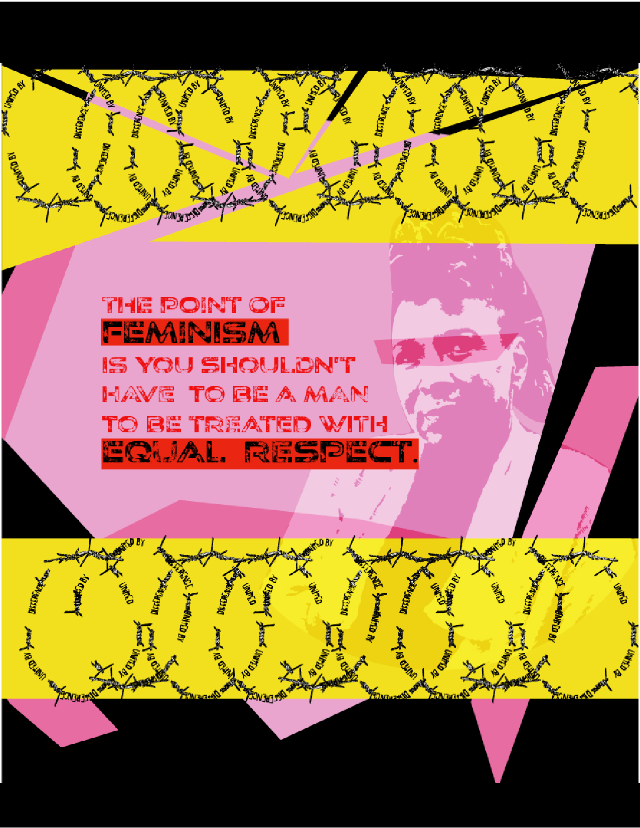
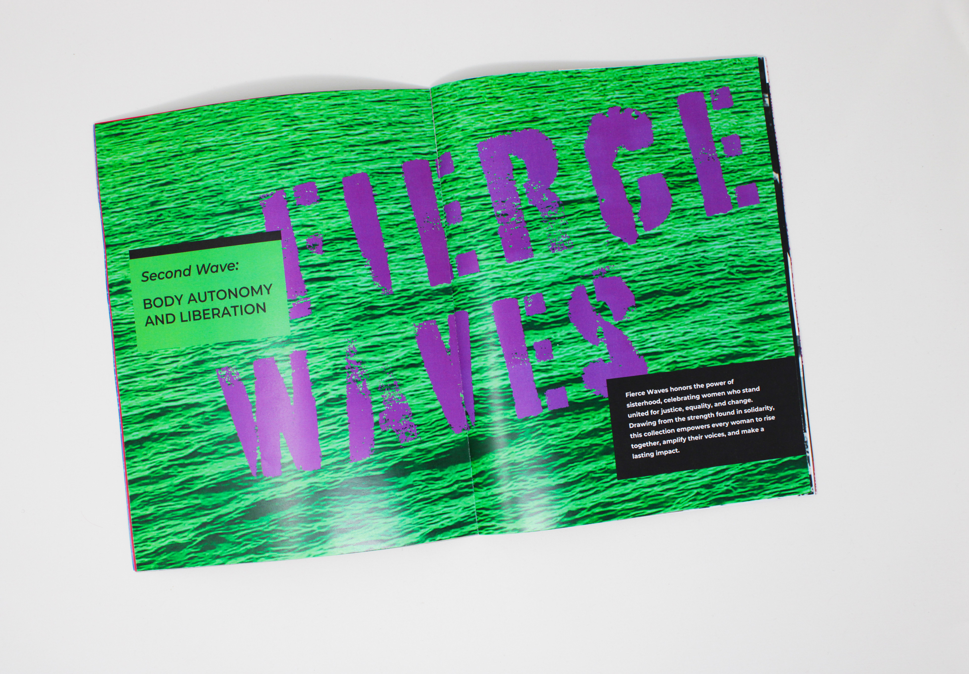
Fierce Waves shifted toward the high-energy activism of Gloria Steinem and Dorothy Pitman Hughes, incorporating layered textures, bold photography, and high-contrast type to capture the urgency of second-wave feminism.
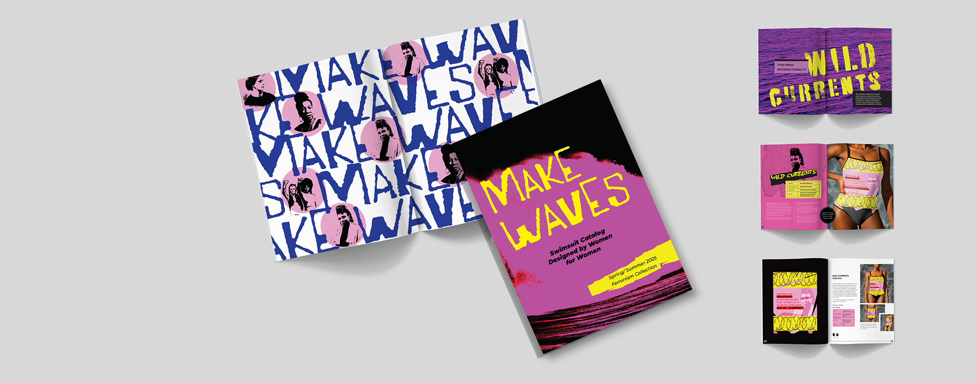
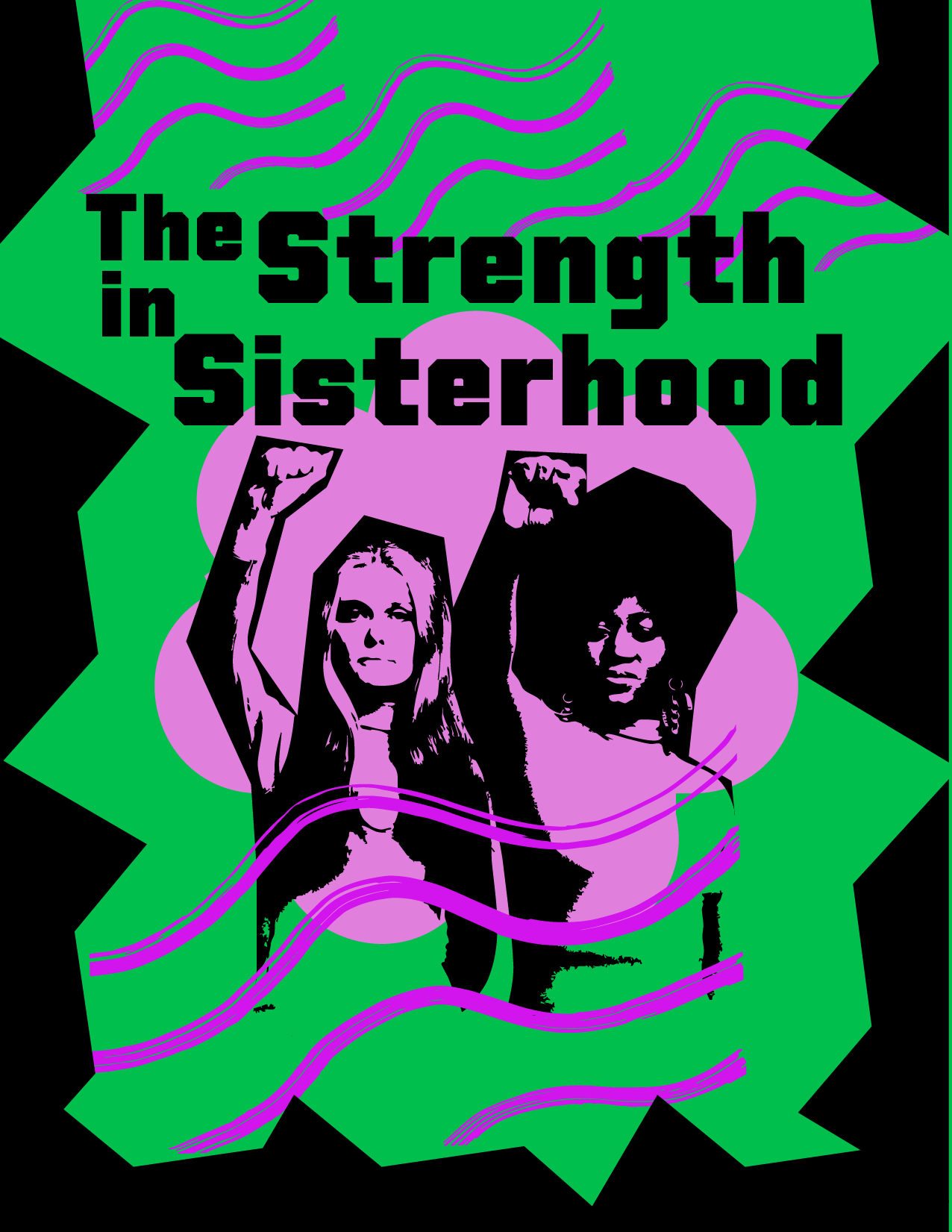
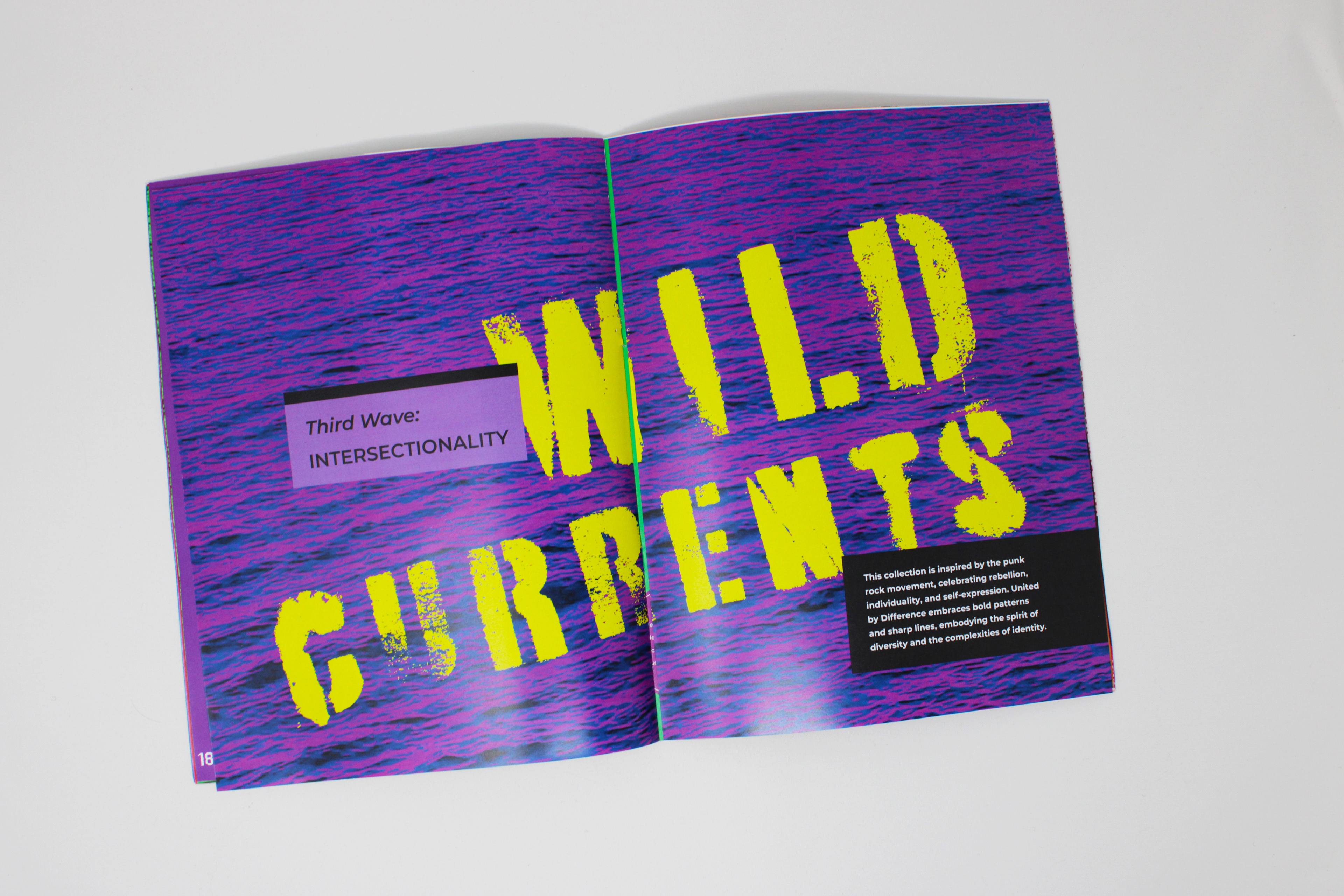
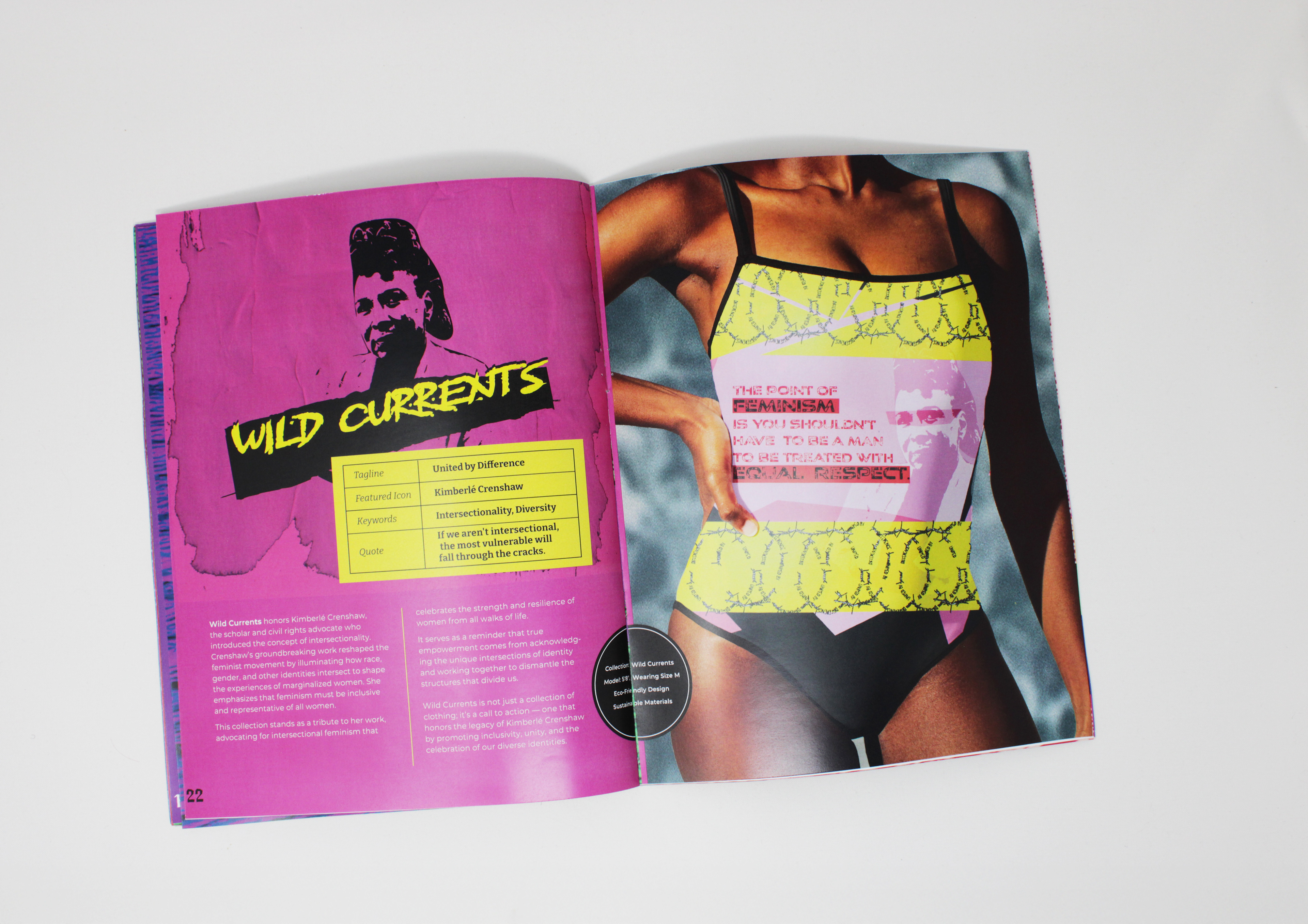
Wild Currents introduced a more fragmented and layered approach, influenced by Kimberlé Crenshaw’s concept of intersectionality. This phase experimented with collage-style compositions and overlapping visual elements to reflect the complexity of identity and inclusion.
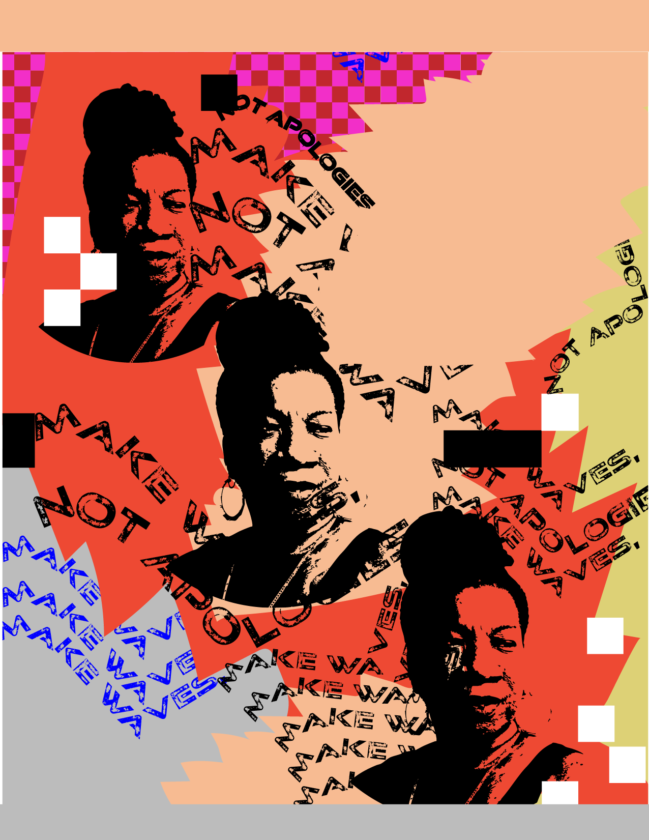
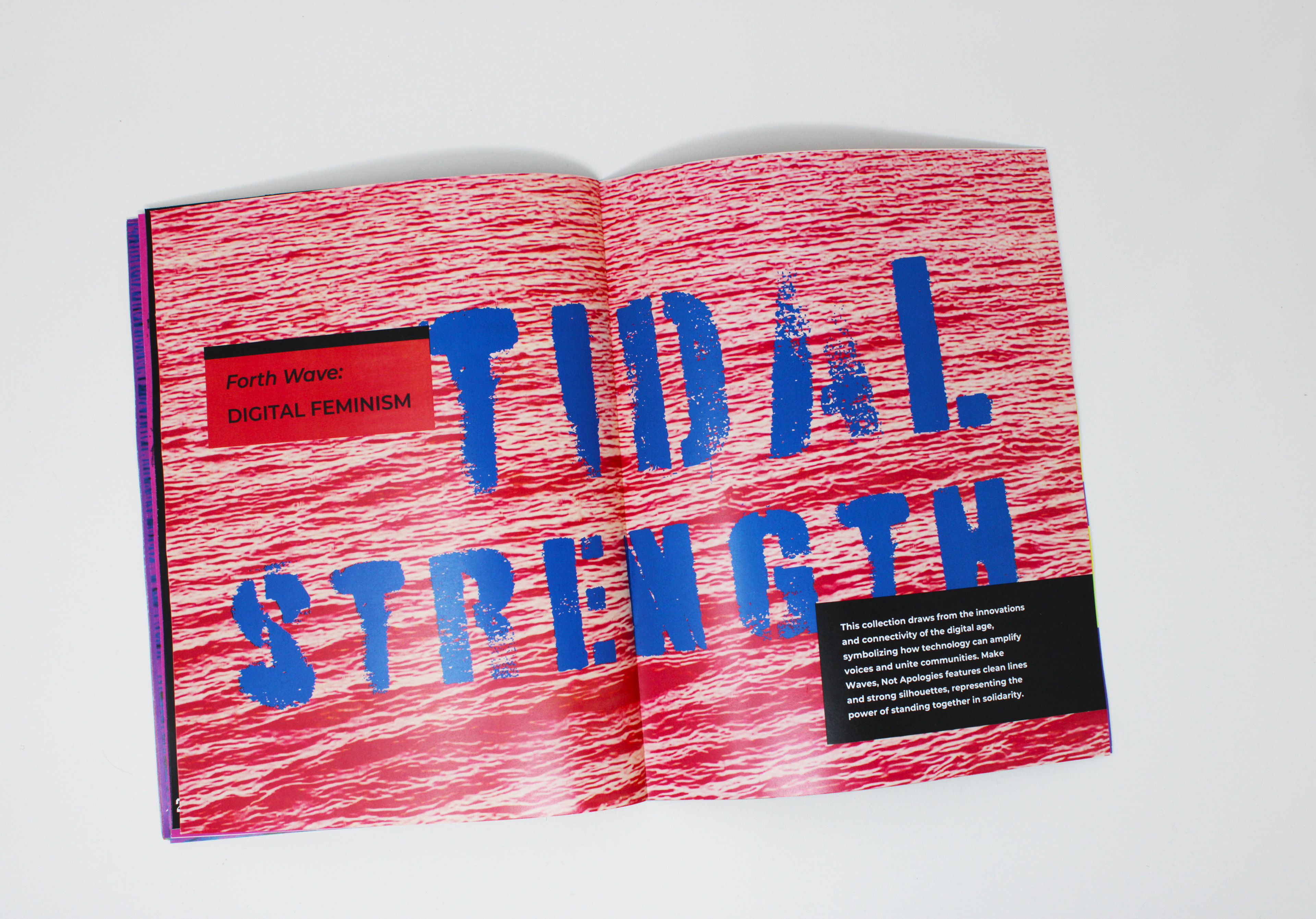
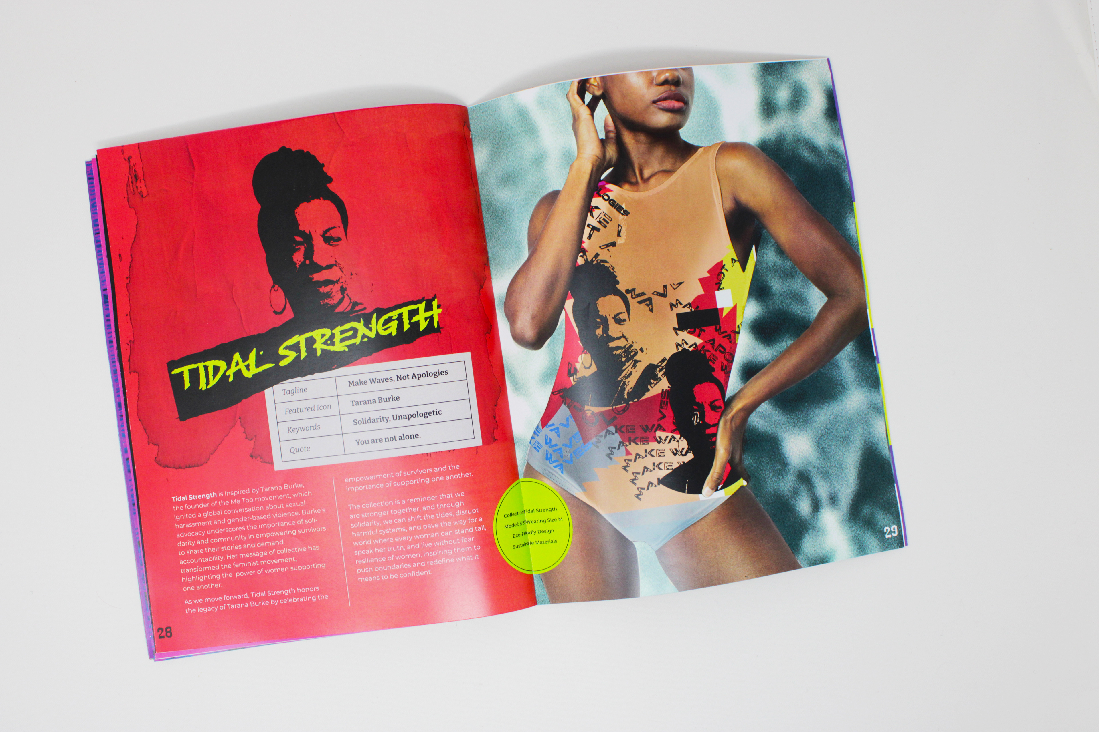
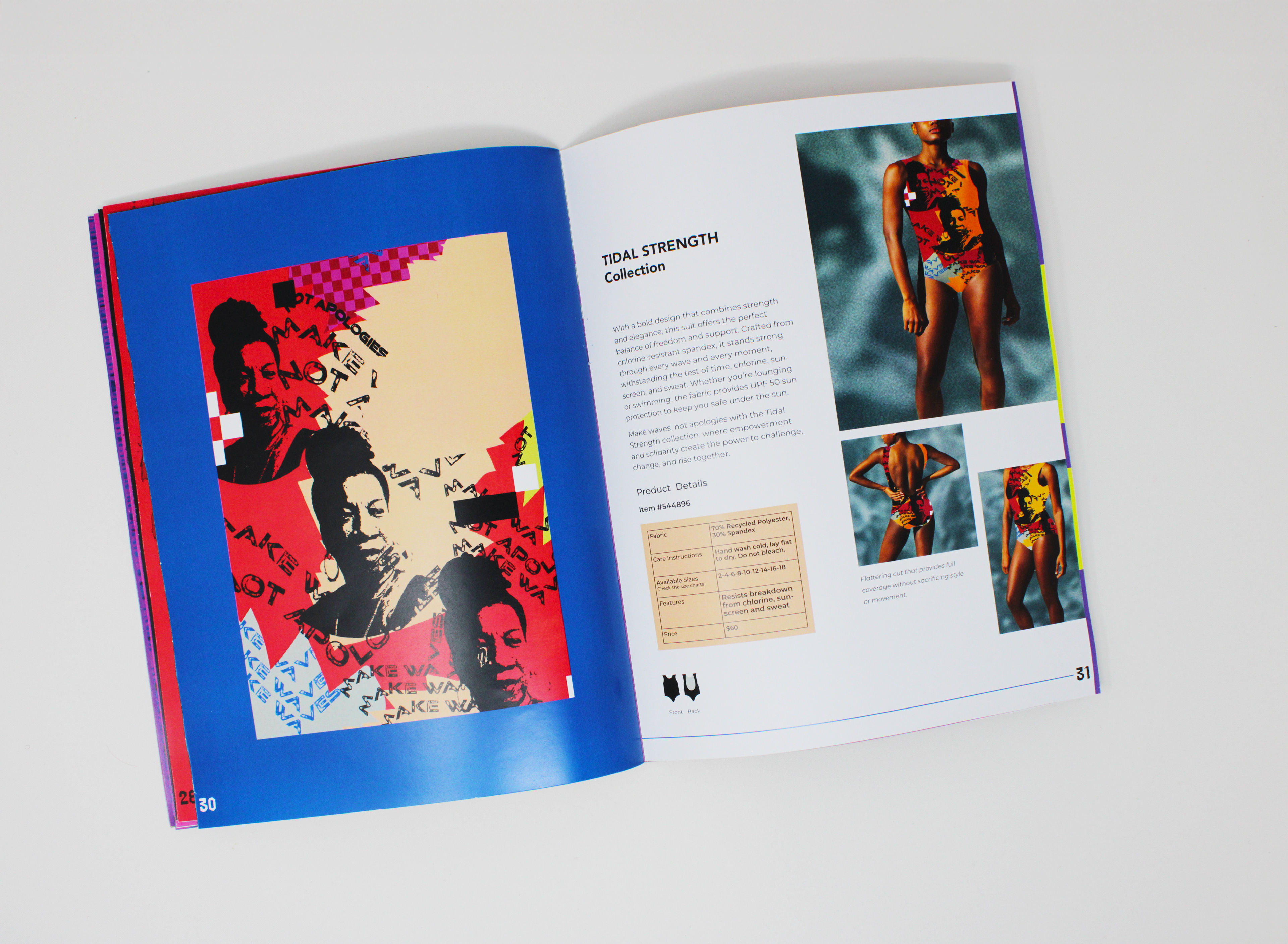
Tidal Strength refined the design language, embracing the immediacy of modern activism. Inspired by Tarana Burke, the final direction leaned into stark contrasts, modular layouts, and bold typography, reinforcing the message of making waves, not apologies while remaining adaptable across different platforms.


Behind the Design
This project challenged me to merge editorial design, brand identity, and cultural storytelling into a cohesive and impactful visual experience. I learned the importance of balancing bold aesthetics with meaningful messaging, ensuring that every design choice reinforced the brand’s rebellious and empowering spirit.
Through this process, I developed new skills in experimental typography, collage-based composition, and expressive visual storytelling, deepening my ability to craft narratives through design. Iteration and exploration of textures, punk-inspired patterns, and feminist iconography helped refine the visual language, making it more dynamic and purposeful.
Instructor: Kelly Holohan
Tyler School of Art and Architecture, Temple University